|
|
| Date | Key | Details... |
| 03 April 2006 |
Charts Revised, Standard Deviation Calculated
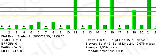
The chart function that displays data from the event log, and the other subsidiary logs, now has a new feature that calculates the statistical Standard Deviation of the data being shown. Here is the way the data shows up:
In all eValid charts you'll see a green line (the average/mean of all values), a yellow line (25% below the average value), and a red line (25% above the average value, provided it can fit on the chart). Most eValid charts are "live", meaning that if you hover your mouse over a part of the chart you're given an explanation of the data that's there. The new standard deviation value should make statistical analysis simpler.
| |