|
|
Explanations
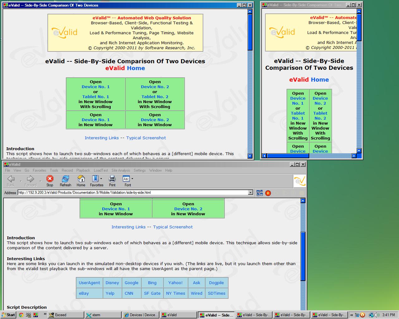
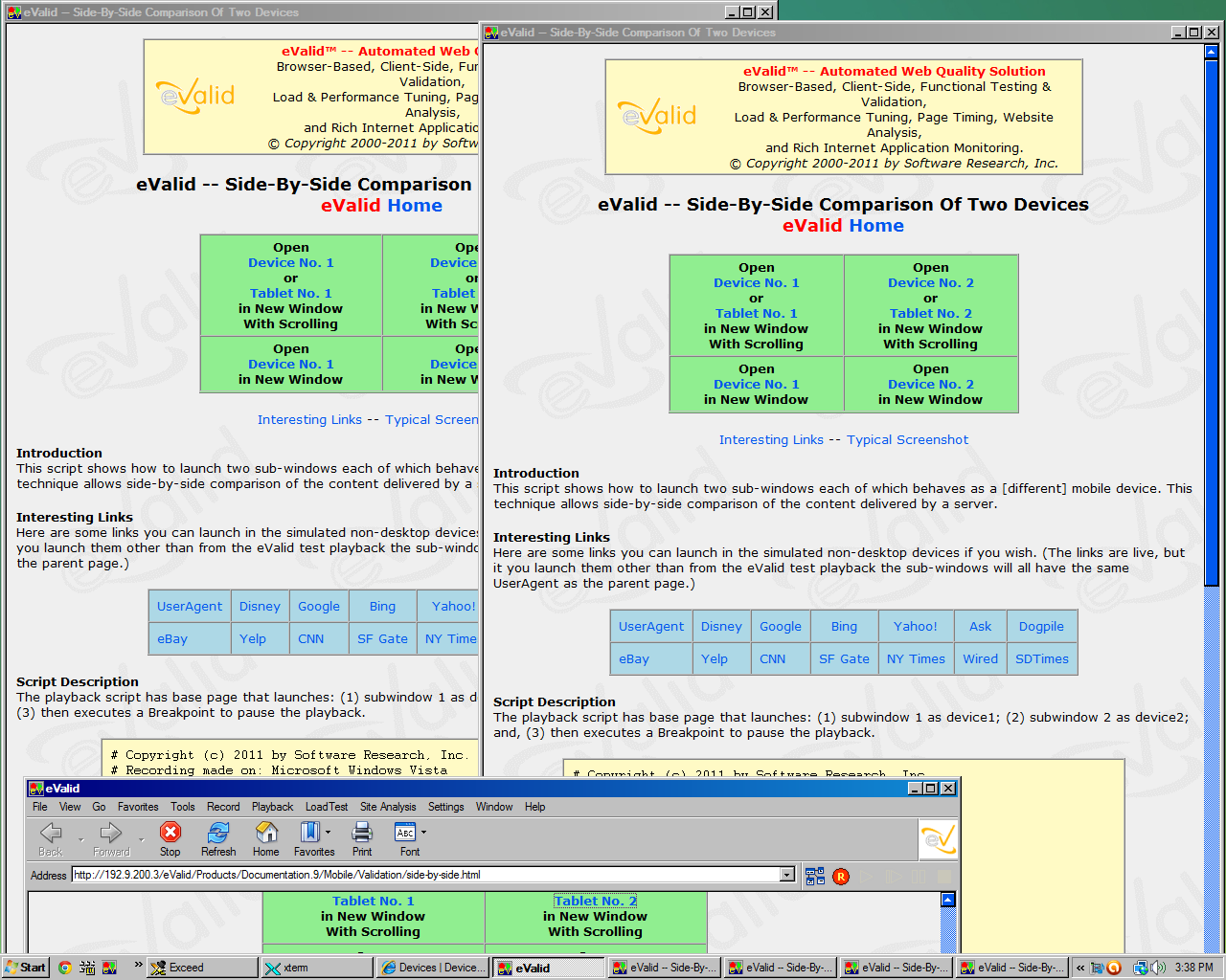
Here are sample screenshots from a desktop host machine that
show the starting page for
Side-By-Side Comparison of Two Devices.
That process results
in two sub-windows being launched,
after the UserAgentString for each has been modified to correspond
to the device identified below the image.
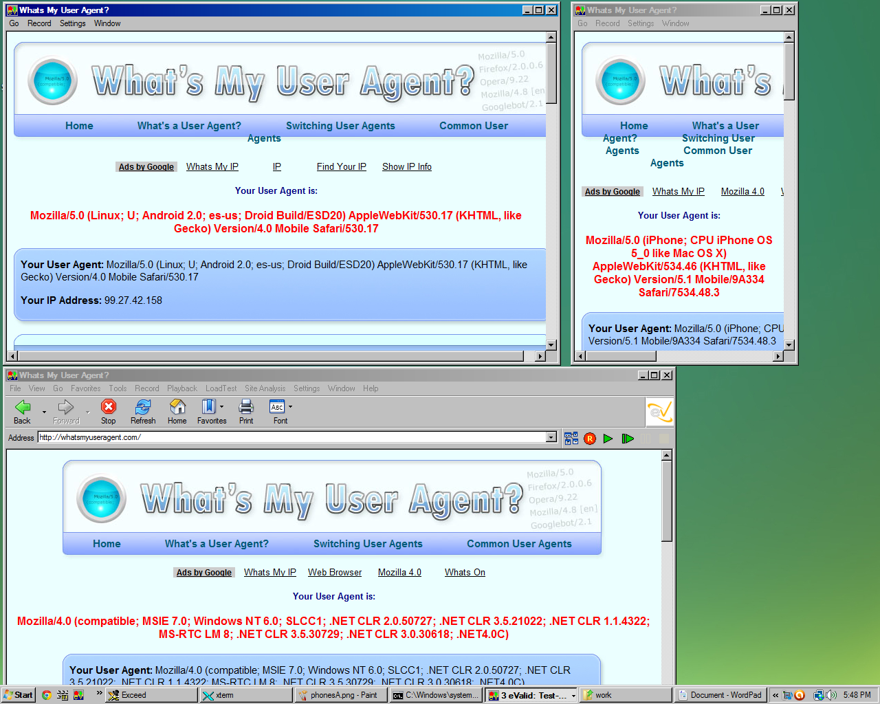
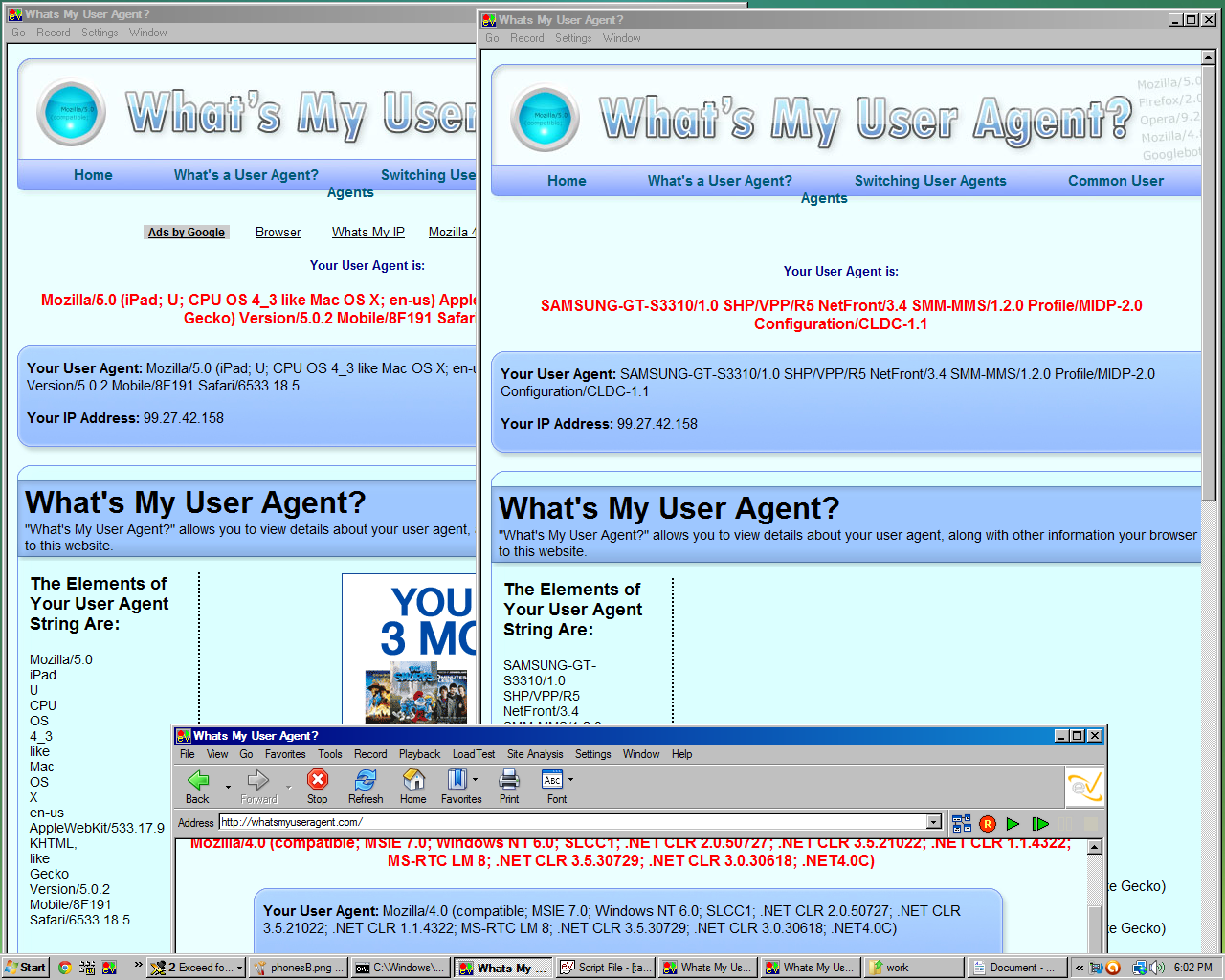
In the sample screenshots shown below, both the original start page (left) and the page after clicking on the UserAgent link are shown (right).
The screens for the mobile devices are "larger" than in real-life because they are desktop renditions of the actual device's usable area. For example, the physical size of the Apple iPhone is 3.5 inches (diagonal) and displays 326 pixels per inch. This resolution is much larger than a typical PC monitor on which a typical resolution is about 72-96 pixels per inch. Accordingly, an iPhone appears on the desktop screen about 3X actual size.
|
Sample Dynamic Screenshots of SmartPhones | ||
| Three Screen Setup With HomePage Displayed | Three Screen Setup with Agent String Displayed | |
|
| |
|
Samsung I9100 Galaxy SII (HxW: 480 x 800)
Apple iPhone (HxW: 480 x 320) | ||
|
Sample Dynamic Screenshots of Tablet Devices | ||
| Three Screen Setup With HomePage Displayed | Three Screen Setup with Agent String Displayed | |
|
| |
|
Samsung Galaxy Tab 10.1 (HxW: 1280 x 800)
Apple iPad2 (HxW: 1024 x 768) | ||